Websites
A simple framework to reduce confusion and increase conversions
Most small business websites don’t fail because they’re “ugly.” They fail because they make people decide too much.
Too many options. Too many menus. Too many directions.
If you’ve ever looked at your site and thought, “It has everything… so why aren’t people converting?”
this is usually why.
The job of a high-converting site is not to impress. It’s to guide.
One clear message, one clear offer, one clear next step.
Quick test
Open your homepage and scan it for 5 seconds.
Can a first-time visitor answer these three questions without scrolling?
What do you do? Who is it for? What should I do next?
The pattern
The #1 conversion killer is decision fatigue
When a visitor lands on your site, they’re trying to reduce uncertainty.
They want to know if you’re credible, if you’re relevant, and what happens if they reach out.
But when you give them five different CTAs, twelve navigation items, and a page that tries to cover every service,
you accidentally create friction at the exact moment you need clarity.
The result isn’t usually a “no.”
It’s a “not now.”
And “not now” is the silent conversion killer.
The fix
Build one obvious path from interest to action
The best websites behave like a good in-person conversation.
You don’t walk up to someone and list every possible thing you could do for them.
You start with a clear statement of what you do, then you guide them to the next step.
Here’s the simplest framework we use to turn “nice website” into “website that converts.”
1. Lead with one clear outcome
Your headline should be a promise, not a description.
Most headlines say what the business is. High-converting headlines say what the customer gets.
Instead of “Full-Service Marketing Agency,” try “Get a website that turns visitors into booked calls.”
Same idea. Completely different clarity.
2. Say who it’s for (and who it’s not)
The fastest way to increase trust is specificity.
If you serve everyone, your site has to be generic. If you serve a clear type of customer, your site can be sharp.
A simple line like “Built for local service businesses and modern brands that need a site that actually performs”
does more than three paragraphs of “we are passionate about helping clients grow.”
3. Make the primary CTA a single decision
Don’t make people choose between five next steps.
Pick one primary action and make it the obvious button everywhere: hero, mid-page, and bottom.
If you want more than one CTA, make the second one clearly secondary.
Example: Primary “Book a call.” Secondary “See work.”
4. Remove uncertainty with a simple promise
People hesitate when they don’t know what happens next.
The easiest way to increase conversion is to explain the next step in one sentence.
Add a “what happens after you reach out” line near your CTA:
“We’ll reply within 1 business day.”
“You’ll get a link to book a time.”
“No spam, no pressure.”
5. Use proof that matches the decision
Testimonials are good, but the best proof reduces the exact fear in the buyer’s mind.
If they’re worried about quality, show the work.
If they’re worried about speed, show your process.
If they’re worried about ROI, show outcomes and conversion wins.
Proof is not decoration. It’s a friction remover.
6. Stop hiding the offer behind the scroll
Your offer shouldn’t be a treasure hunt.
Within the first screen, visitors should see:
what you do, who it’s for, why it matters, and what to do next.
If they have to scroll three times to find how to work with you,
your site is accidentally filtering out high-intent leads.
7. Reduce the menu
Navigation is not a sitemap. It’s a conversion tool.
Every link is an exit ramp.
If your main goal is to book calls, your nav should support that goal.
Keep only what a buyer needs to decide:
Work, Services, About, Blog, Contact.
Everything else can live deeper.
Common mistakes
The 3 ways “more content” lowers conversion
Mistake 1. Multiple equal CTAs
If your homepage has “Book a call,” “Download the guide,” and “See pricing” all competing,
you’re asking your visitor to choose a path before they trust you.
Most will choose none.
Mistake 2. Services listed like a menu
Long service lists don’t create confidence. They create doubt.
Visitors start wondering which option they need, whether they’re picking wrong,
and whether it’s going to be complicated.
Bundle your services into one simple offer and guide them into the right next step on a call.
Mistake 3. Vague messaging that could fit anyone
“High quality.” “Customer focused.” “Results driven.”
None of those phrases differentiate you.
They signal “generic” and force your visitor to keep looking.
Bottom line
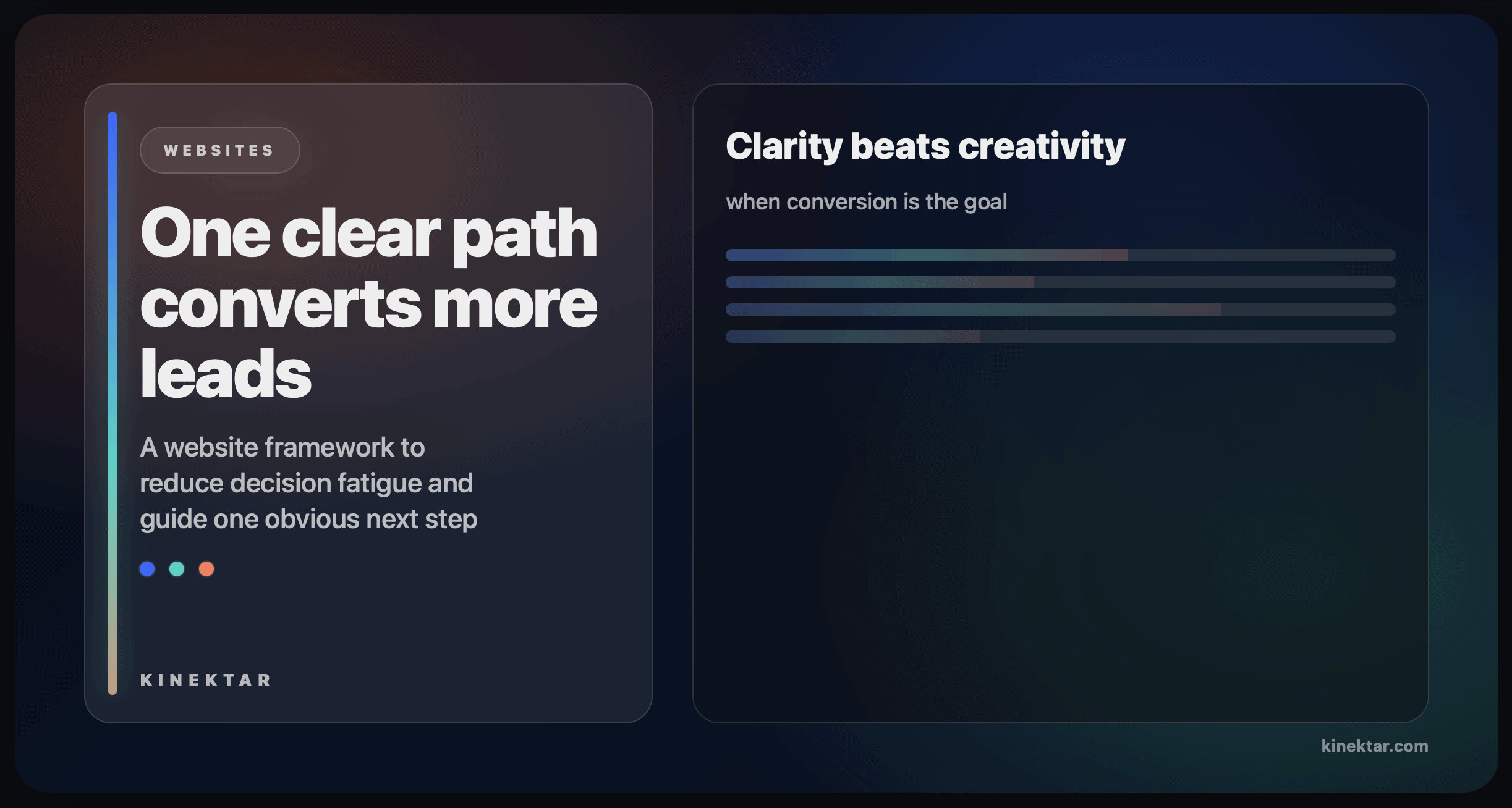
Clarity beats creativity when conversion is the goal
You don’t need to rebuild your entire website to improve conversion.
You need to remove competing paths and make one next step obvious.
If you want a quick, practical way to spot where your site is leaking leads,
we can run a fast scorecard and tell you what to fix first.